Web & User Experience Design
Libraries, archives, and higher education are at the core of my design work.
- Library Home Page, c. 2017 (archive.org)
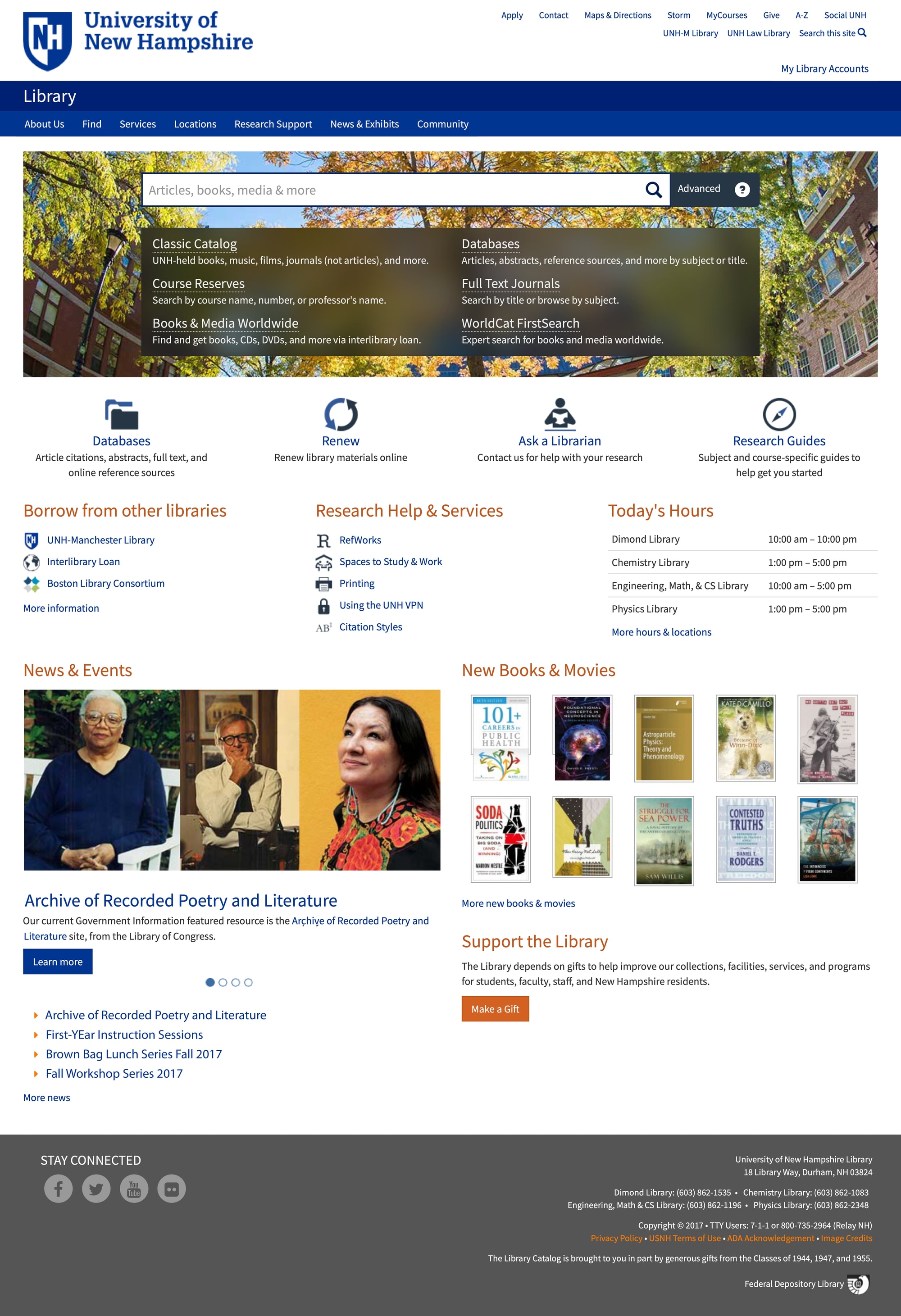
The University of New Hampshire Library was an early adopter of the world wide web, having published web sites as far back as 1996.
The complete web site redesign took our project team 3 years. We reviewed hundreds of pages, of which 60% were kept and revised. The site used a Drupal theme created from a template by UNH designers.
Re-Designing the Catalog Search Box


A new search platform for the library catalog meant redesigning the centerpiece of the home page, the Search Box. The team took an iterative approach, testing with users multiple times.
- UNH Library Home Page, today (library.unh.edu)
Geospatial Search

- Geospatial Search (place.unh.edu)
My work on the University of New Hampshire PLACE project included testing an existing GIS web application, Open GeoPortal, with representative users. The results are published in the UNH Scholars Repository†.
PLACE is a geospatial data repository and search interface for digital collections. Usability testing helped us design features like the gazetteer search and a time slider.
The project was funded by the Institute of Museum and Library Services, National Leadership Grants for Libraries Program.
† Wolff, Rob and Parker, Kristin, "Usability Testing: Open GeoPortal 2.0" (2014). PLACE Project. 9.
Aspect Ratio
This visualization of screen and image aspect ratios includes everything from Instagram Stories (0.56) to Ultra Panavision (2.76).
Carbon (CO2)
This data visualization exercise uses D3.js to show historical carbon, future scenarios developed by the Intergovernmental Panel on Climate Change (IPCC), and the recommended limit of 350 ppm.

User Experience Design
Library Rangefinders

When the library rearranged their stacks, we took the opportunity to assess wayfinding, including stack arrangement, and signage.
One result was this redesigned rangefinder (below, left) which adds a visual hierarchy to help patrons scan the call number, a common source of confusion.
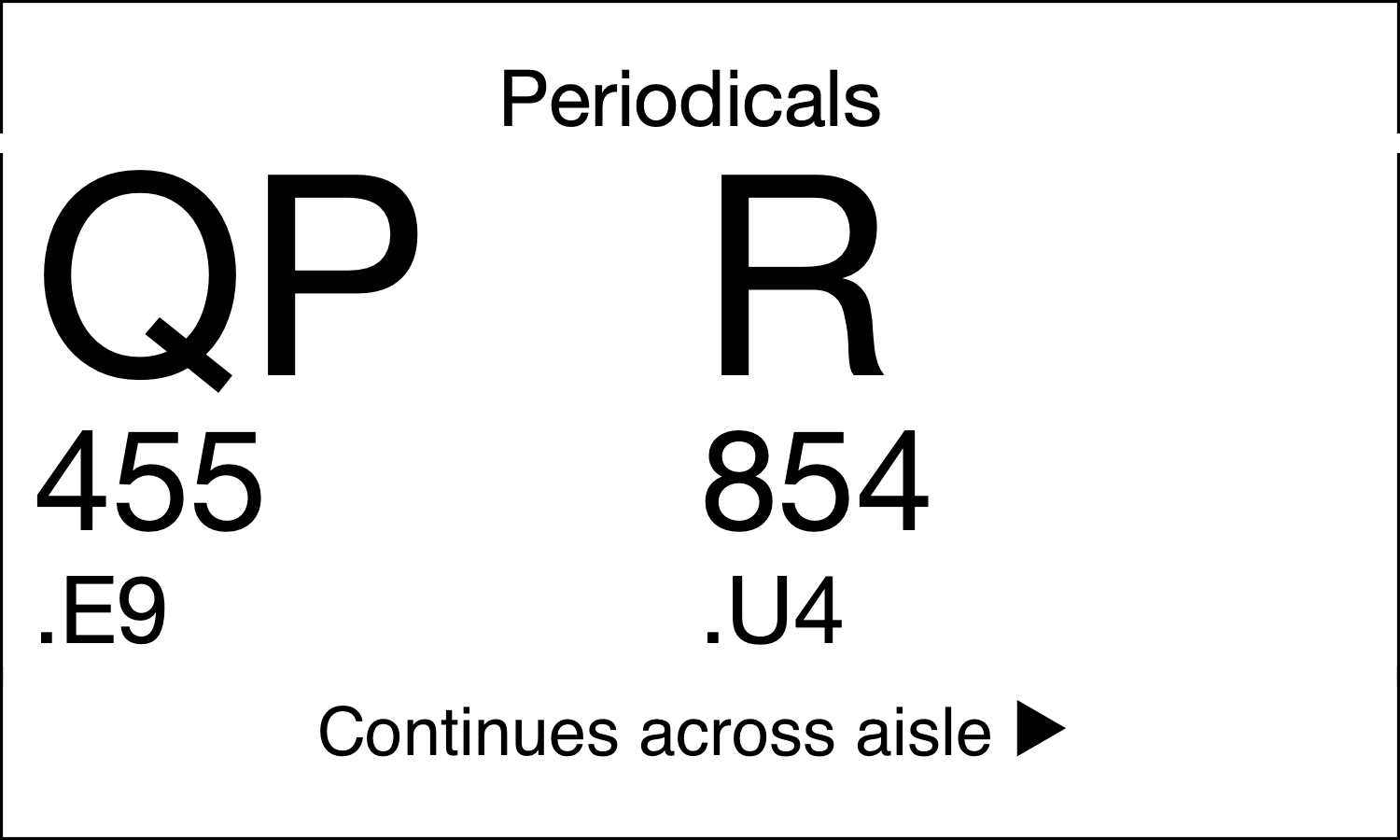

Circulation staff opted to simplify range boundaries to make shifting materials easier. This also helped refine the design.
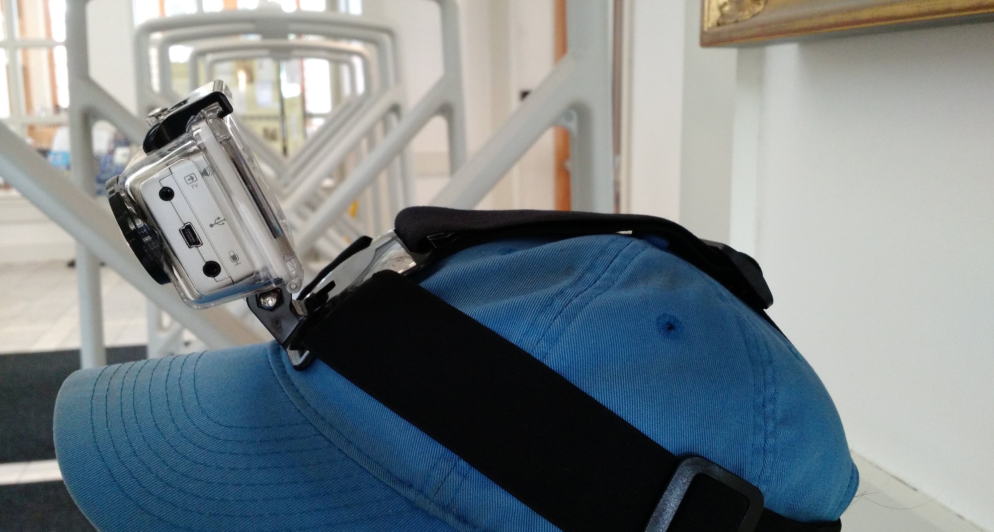
We used a head-mounted GoPro camera to record wayfinding testing for later review. This worked well, but reviewing the footage required special care.